UI / UX Design
Dashboard
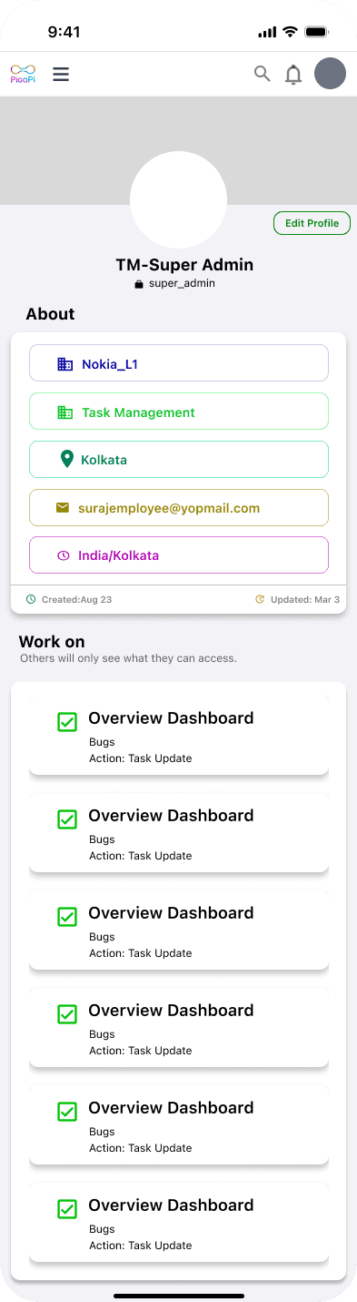
A mobile-first dashboard designed to help organizations monitor projects, manage teams, track performance, and improve productivity through a clean and data-driven interface.
Project Duration :
3 Months

Problem :
Organizations often struggle to monitor project progress, employee performance, and task completion across multiple branches. Existing enterprise dashboards contain excessive information, making it difficult for managers to quickly understand business performance.
The goal was to create a clean, intuitive, and mobile-friendly dashboard that allows users to access key business metrics, manage teams, and monitor organizational performance with minimal effort.

Design Process
Research
↓
Information Architecture
↓
Wireframes
↓
UI Exploration
↓
High Fidelity Design
↓
Prototype
↓
Iteration


Design Challenges
Information Density
Enterprise dashboards contain large amounts of data. The challenge was prioritizing the most important metrics while keeping the interface visually balanced.
Mobile Constraints
Displaying charts, statistics, and recent activity within limited screen space without sacrificing readability.
Component Consistency
Creating reusable cards, charts, buttons, and navigation patterns to maintain consistency throughout the application.
Design Solution
Dashboard organized using card-based layouts
Color-coded KPI widgets for quick recognition
Visual charts for better analytics
Consistent spacing and typography
Bottom navigation for quick access
Minimal visual clutter

More Projects



UI / UX Design
Dashboard
A mobile-first dashboard designed to help organizations monitor projects, manage teams, track performance, and improve productivity through a clean and data-driven interface.
Project Duration :
3 Months
Problem :
Organizations often struggle to monitor project progress, employee performance, and task completion across multiple branches. Existing enterprise dashboards contain excessive information, making it difficult for managers to quickly understand business performance.
The goal was to create a clean, intuitive, and mobile-friendly dashboard that allows users to access key business metrics, manage teams, and monitor organizational performance with minimal effort.
Design Process
Research
↓
Information Architecture
↓
Wireframes
↓
UI Exploration
↓
High Fidelity Design
↓
Prototype
↓
Iteration
Design Challenges
Information Density
Enterprise dashboards contain large amounts of data. The challenge was prioritizing the most important metrics while keeping the interface visually balanced.
Mobile Constraints
Displaying charts, statistics, and recent activity within limited screen space without sacrificing readability.
Component Consistency
Creating reusable cards, charts, buttons, and navigation patterns to maintain consistency throughout the application.
Design Solution
Dashboard organized using card-based layouts
Color-coded KPI widgets for quick recognition
Visual charts for better analytics
Consistent spacing and typography
Bottom navigation for quick access
Minimal visual clutter
More Projects
UI / UX Design
Dashboard
A mobile-first dashboard designed to help organizations monitor projects, manage teams, track performance, and improve productivity through a clean and data-driven interface.
Project Duration :
3 Months
Problem :
Organizations often struggle to monitor project progress, employee performance, and task completion across multiple branches. Existing enterprise dashboards contain excessive information, making it difficult for managers to quickly understand business performance.
The goal was to create a clean, intuitive, and mobile-friendly dashboard that allows users to access key business metrics, manage teams, and monitor organizational performance with minimal effort.
Design Process
Research
↓
Information Architecture
↓
Wireframes
↓
UI Exploration
↓
High Fidelity Design
↓
Prototype
↓
Iteration
Design Challenges
Information Density
Enterprise dashboards contain large amounts of data. The challenge was prioritizing the most important metrics while keeping the interface visually balanced.
Mobile Constraints
Displaying charts, statistics, and recent activity within limited screen space without sacrificing readability.
Component Consistency
Creating reusable cards, charts, buttons, and navigation patterns to maintain consistency throughout the application.
Design Solution
Dashboard organized using card-based layouts
Color-coded KPI widgets for quick recognition
Visual charts for better analytics
Consistent spacing and typography
Bottom navigation for quick access
Minimal visual clutter